Work/Case 001 · Self-initiated · 2026
Mulder Media Group,rebuilt.
A new identity, website and launch kit for our own studio. Designed, built and shipped in September 2026.
- Client
- Mulder Media Group (us)
- Scope
- Identity, website, launch kit, motion studies
- Year
- 2026
- Status
- Live
(01) The problem
An identity that couldn’t scale down.
The old logo was a brush script saved only as a low-resolution image. There was no symbol, no favicon and no vector file, so it could not shrink to an app icon or grow to a sign. The website ran on a site-builder template that looked like everyone else’s.
(02) The idea
The signal,
precisely placed.
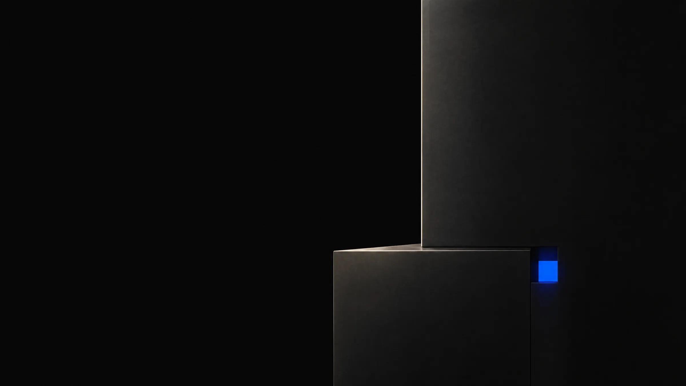
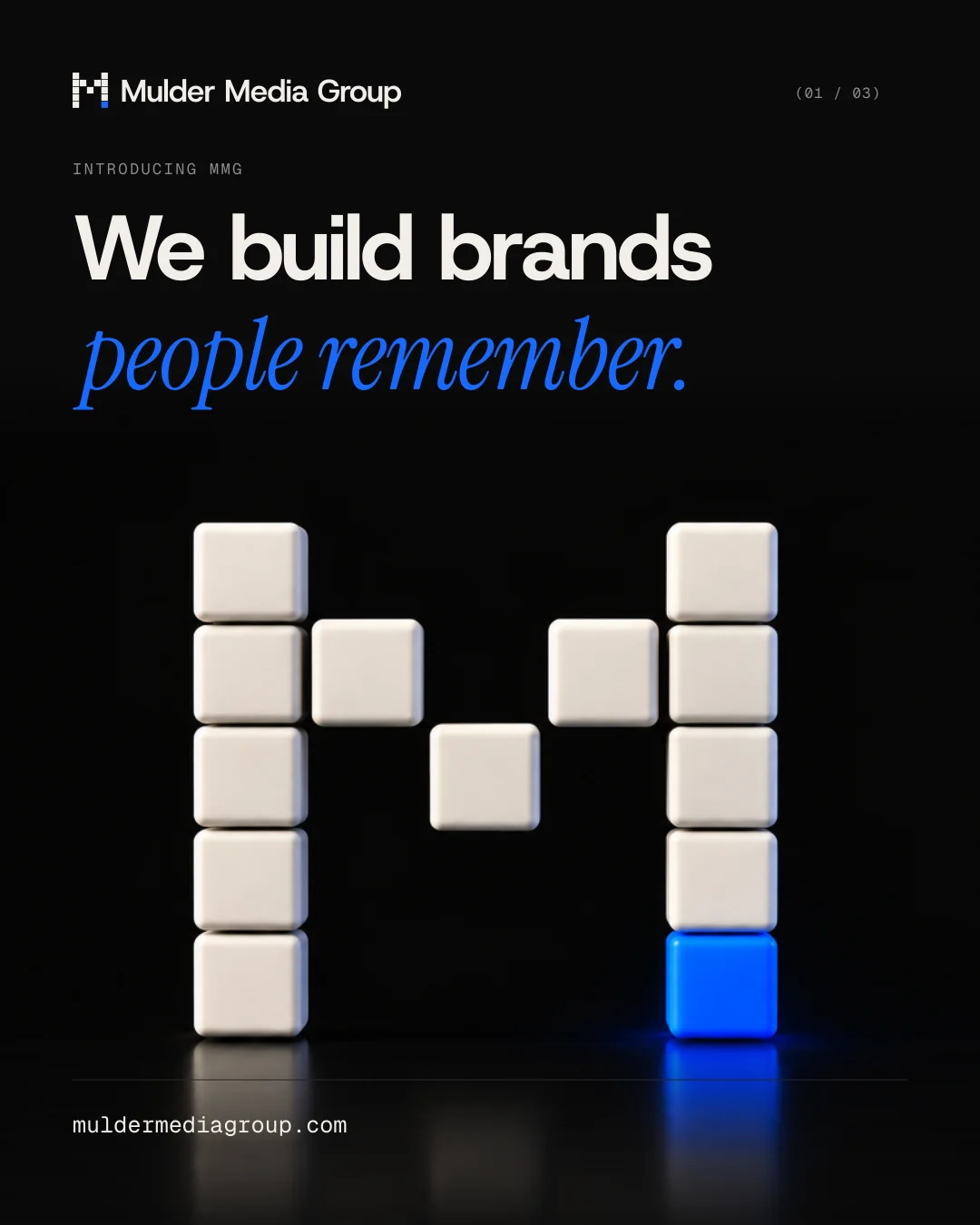
A five-by-five grid of square blocks forms the M. Twelve are warm white. The thirteenth, bottom right, is electric blue: the one point the eye lands on. Every other decision in the system exists to protect that single signal.

(03) Decisions
- 01
A mark that survives 16 pixels.
No curves, no gradients, no fine detail. The favicon and the sign are the same file, so the brand never has to be redrawn to fit.
- 02
One accent, measured.
Electric blue measures 4.24:1 on black, below the 4.5:1 that small text needs. So it carries large type and fills only, and a lighter blue (6.78:1) carries anything small.
- 03
Three typefaces, one job each.
Host Grotesk does the talking. Instrument Serif italic adds one or two words of emphasis per headline. Geist Mono labels and numbers things. Nothing else.
Aa
Host Grotesk
Headlines, body, interface.
Aa
Instrument Serif Italic
One or two words of emphasis, display sizes only.
Aa
Geist Mono
Labels, index numbers, captions.
(04) In use
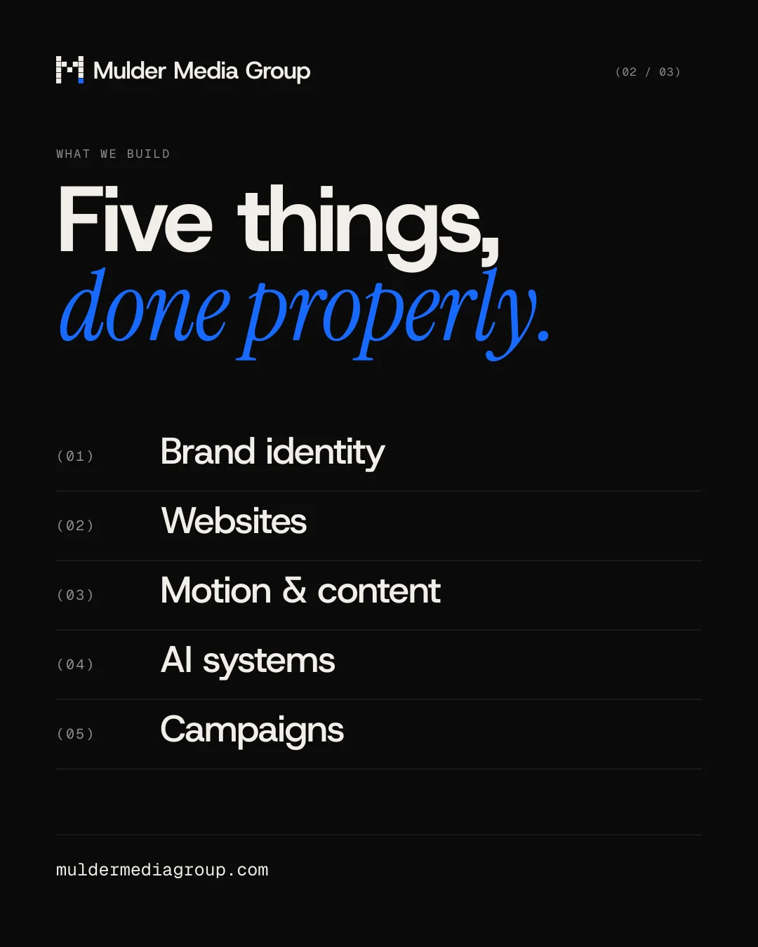
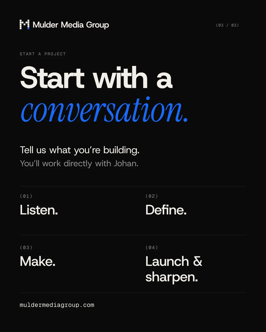
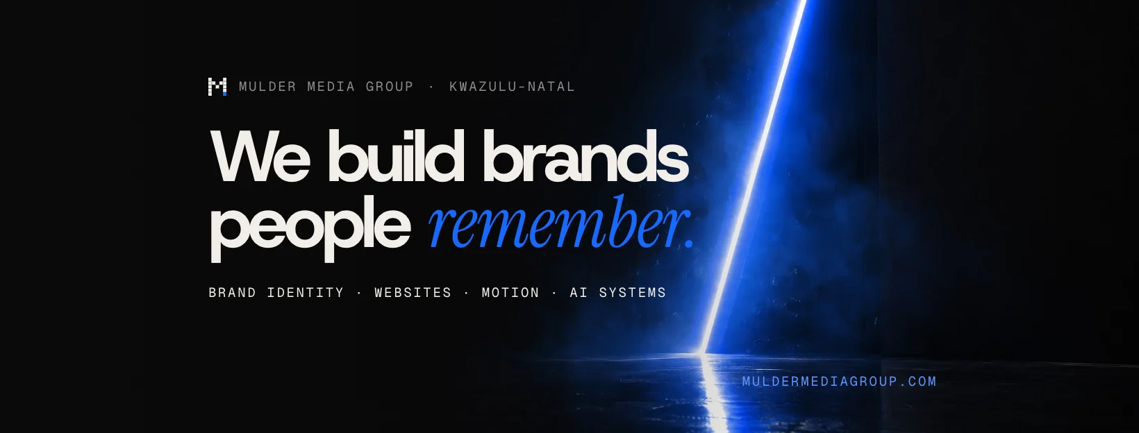
From a 16 px favicon to a launch campaign.
(05) Measured
- Blocks
- 13One master SVG, used from the 16 px favicon to 1080 px posters.
- Text contrast
- 17.24:1Warm white on black. The accessibility minimum for body text is 4.5:1.
- Third-party scripts
- 0No trackers, no ad tags, no outside code. The site loads only its own files.
- Stock photos
- 0Every image on the site is art directed in-house.
Credits
- Strategy, identity, design, code
- Johan Mulder
- Imagery
- Art directed in-house with Higgsfield